The 10 Best Data Visualization Software
Data visualization involves presenting data in a form easy to read and interpret. Simple data visualization tools include simple bar graphs or standard charts like the ones used in spreadsheets. Nowadays, a lot of data is being collected which in turn calls complex data visualizing tools.
Tools like infographics, fever charts, heat maps, and dials are aimed to address the problem of visualizing complex data systems. Such tools contain images which represent a related field to capture the reader’s attention. Others have some indicators which alert readers when some data field has been manipulated.
In computer systems, such data visualization tools are hosted in visualization software.
This article discusses the 10 best Data Visualization Software today.The Best Data Visualization Software Compared (in full)
Check all the services in detail as per your needs and choose service wisely – by the end, you’ll know exactly which one is the right option for you.
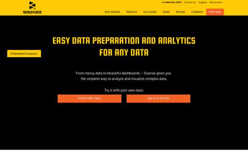
1. Sisense
Sisense offers a wide range of well-prepared impressive dashboards to present data. Even when your data is very complex, Sisense organizes it in a simple way, where you can easily visualize it.
Sisense has the following desirable features:
- Data preparation tools – You may have come across data representation tools like star schemas and OLAP cubes. The truth is that they are tiresome to work with. With Sisense, you can create several data representation models in a single interface that is simple to understand
- Interactive data analysis – Sisense has web dashboards that contain interactive data representation platforms. Watch all your data trends with Sisense interactive analysis tools.
- Flexibility – You can add new data sheets without first having to create separate tables or databases. This feature allows you to easily update your data whenever you want.
- Sisense is one of the most interactive yet simple to use data visualizing software.
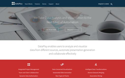
2. Dataplay
Dataplay allows users visualize and manipulate data stored in various locations and integrate it with automated presentation features. This allows for a good collaboration between the data users and the data itself.
Some of its best features include:
- Wide data integration formats – There is no limit to which data formats you can integrate into your system when using Dataplay. The software supports a wide range data formats.
- Automated visualizations – Dataplay uses a wide variety of visualization tools to make sure that your data is interactive enough. You will not have a boring and idle interface when using Dataplay.
- Central point of data management – You can manage your data from a centralized location when using Dataplay. This allows you to input the necessary updates to the necessary tables and columns.
- Dataplay has a web portal which can be accessed from any device. That means that you will always have access to your data whenever you want.
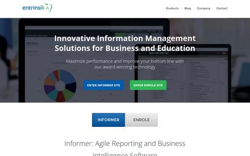
3. Entrisik
Entrisik visualization software offers the most innovative changes for information management in both education sector and businesses. It helps improve one’s business by increasing the efficiency of the technology the businesses are using.
It has the following desirable features:
- Intelligent reports – Entrisik presents its clients with reports that have been analyzed fully. When using it, clients can just to choose to use the reports the way they are without further manipulation.
- Security – Entrisik requires that users have the correct login details to manipulate data. This helps keep your data secure by avoiding outsiders from manipulating your data.
- Friendly user interface – You can drag a file or information and drop it in the location you want when using Entrisik. It allows for this feature.
Entrisik is not only very friendly to use but also one of the most dynamic and effective visualization software today.
4. Dundas
Dundas ranked no 1 on the Business Analytics Leaderboard of 2022. It contains some of the best visualization dashboards and analytic features.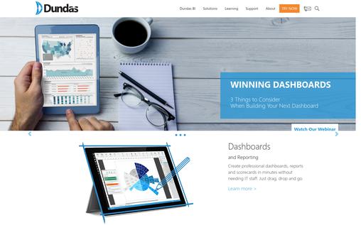
Dundas has the following most desirable features:
- Reporting dashboards – After data is analyzed in Dundas, the reports are represented for viewing in professional dashboards. The good thing is that you need not be an IT expert to use Dundas. Simple drag and drop operation will put your data where you require it.
- Data mining and analysis – Dundas has an inbuilt memory for use in data analysis. You will retrieve you data insights fast enough with just one click.
- Comprehensive data integration – You have a full control of your databases and all manipulations needed. You can customize the reporting dashboards however you want when using Dundas.
With inbuilt memory ton help users in data mining, Dundas is one of the most powerful visualization software in the market today.
5. Tableau
Tableau allows you to visualize and present your data with ease. It also allows for its clients to share their organized and easy to view data easily.
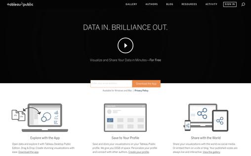
The following are the best features you should expect when using Tableau:
- Great visualization capabilities – If you feel like you need to include a certain file in a specific table or location in your database, then you can drag and drop it where you want. Tableau allows for this feature to make it simple to visualize and manipulate data.
- Flexible profile – You can create a profile with tableau where you can store your visualized data. They offer up to 10 GB of storage space for their clients.
- Social media links – If you want your friends and other businesses to see your visualized data platforms, then you can link to social media and let interested viewers view your tableau visualizations.
Tableau helps you make a name for your business company by making you known out there through their social media link.
6. Chart.js
Chart.js offers the most flexible and simple JavaScript visualization charting for both developers and designers. This allows for customization whenever necessary.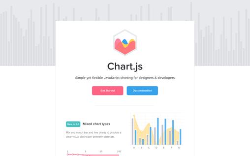
Here are the desirable features of chart.js you should expect:
- Combined charts – Datasets in chart.js are presented both in bars and lines to give a clear visual of current data trends.
- Animated data representation – Chart.js uses animated boxes, which may change their size or color when there is an input or update.
- Mixed axis plots – Chart.js doesn’t use the usual simple plot axis to represent data. It uses complex axis plots which can be easily customized if the need arises.
With its flexibility in design and coding language, chart.js allows both developers and designers to customize data visualization accordingly.
7. DashBoards
DashBoards focus on bringing clarity the data you have stored as much as possible. You will not struggle to arrange and disarrange your charts and maps when using dashboards.
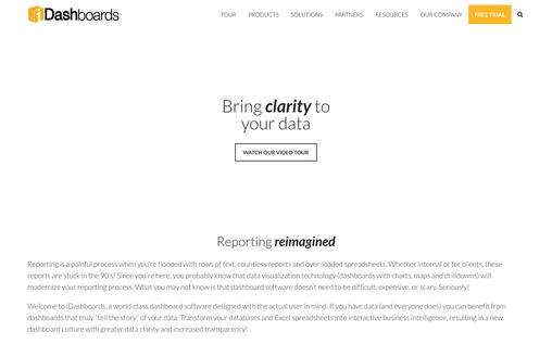
Here are some of its most desirable features:
- Clear reports – You can have your data analyzed and manipulated but presented in the wrong format. Dashboards give you a clear visualization or your reports and data tables.
- Data sharing – You can make your staff members feel like they are part of the company. This is by making data sharing possible inside your organization.
- Unlimited views – You can have as many views on different dashboards, all login into your primary dashboard.
DashBoards offer some of the most powerful data visualization features today. It also gives clear reports that are simple enough to understand.
8. Inetsoft
Inetsoft allows its clients to sift through complex data systems and spot the necessary current trends as well as be able to manipulate the data accordingly.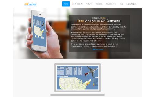
These are the desirable features you should expect when using Inetsoft:
- Live visualizations – Inetsoft brings you live visualizations of the data fed into it. It allows you to make immediate decisions according to the live feeds you are receiving.
- Uploading feature – You can easily upload your data on Inetsoft server. From there you will have it ready to be transformed into the best visual dashboard representations.
- Data analysis – Inetsoft allows its clients to filter their data and generate the specific reports they need.
Inetsoft’s live visualizations are one of the most desirable features any visualization software can hope to have. It allows users to keep in touch with their data live.
9.Visually
Visually presents some of the most beautiful information designs and data visualizations. It offers interactive websites, infographics at most affordable costs.
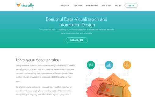
It has the following desirable features:
Infographics – These are some of the most powerful tools of visualizing data. They contain information embedded in related data graphs. Visually uses them to present some of the most beautifully visualized data.
Social media links – A lot of interested clients can be gotten from social media. Visually gives its clients a link to social media where they can join and interact with interested clients.
From interactive websites to perfect infographics, visually is one of the most powerful visualization software.
10. FusionCharts
FusionCharts is perhaps the most powerful charting library coded in JavaScript. It hosts about 100 charts and over 1000 maps. It is also popular in many countries and has many users.
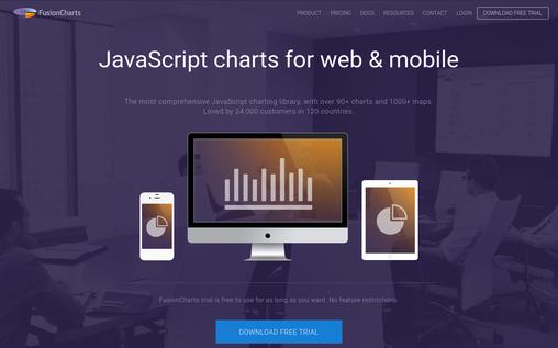
When using FusionCharts, here are the features you should expect to see:
- Live examples – This feature helps you to make your own guided charts and graphs.
- Wide range of charts and maps – the option is yours to choose which chart or map to use when using FusionCharts.
- Live dashboards – FusionCharts has live dashboards in which you can view the trends in your data. It allows you to note and make the necessary updates.
FusionCharts has rich databases of visualization tools to use. From charts to maps; it also boasts some of the most extensive coverage in terms of users.
Conclusion
Data is primarily useless if it has not been managed accordingly. First, it needs to be organized, and then manipulated accordingly. Lastly, data needs to be clearly presented in a well-visualized manner. The above software systems ensure that you get to see almost everything you need to see in your data records, all in a clear manner.
You May Also Like:-